


When?
12 + 13 – 19 + 20 – 26 + 27 MARCH
from 3 to 5.30 PM
Reservation here
|

CN - Architect & Interior Designer
Architect & Design Interior

When?
12 + 13 – 19 + 20 – 26 + 27 MARCH
from 3 to 5.30 PM
Reservation here
|


Caroline Notté is happy to present two new Belgian brands
K A R O L I N V A N L O O N & O C T O G O N Y
during a drink
Thursday 10th of February 2022
from 5.30 to 8.30 PM
@ Louis Herman de Koninck’s House
Please confirm your attendance before February 4 by email.


I N T U I T I O N
I S
T H E K E Y
T O
E V E R Y T H I N G
Just as the layered beauty of agate takes millions of years to form, a design does not simply spring from nowhere. Starting from the rawness of nature, Karolin works with care and respect to create something valuable. There are no changes, only additions. Nevertheless, nothing is self-evident.
The natural resonance between people is also important in her work, as is each individual’s own unique identity. By bringing together our different worlds rather than replicating them, we create a new universe in which we strengthen one another.


O C T O G O N Y
I S B O R N
Infused by brutalist architecture and the spirit of the ‘60s. A perfect combination of aesthetics and pragmatism. The octangle is its heart, emerging through every custom-made detail: monogram, buckles, strap details, flap curves, octangle- shaped mirror.
Functional modularity becomes octogony’s defining characteristic. Several volumes of bags accompanied by their very own secondary bags and accessories.Customized with a choice of straps. High quality materials, timeless design, and second-life construction situate the brand in the humble luxury segment.
octogony.com


A designer who graduated in 2002 from the Nantes Atlantique School of Design, Guillaume Delvigne began his career between Milan and Paris, working with big names such as George Sowden, co-founder of the Memphis movement, and Marc Newson, a star of contemporary design. In 2011 he launches a solo show, inaugurates his first solo exhibition at the ToolsGalerie and wins the Grand Prix de la Création de la Ville de Paris. Today he works with craftsmens, publishers or industrialists mainly in the fields of furniture, objects and lighting. His clients are major French and foreign companies or younger publishers (Hermès, Frandsen, Hanoia, Lexon, La Chance, ENO studio, Hartô…). Guillaume Delvigne is an illustrator. His highly sensitive work is influenced by photography, architecture and more generally by everything visual. He is looking for the perfect balance, his paw is soft and uncluttered while being extremely rigorous, his sense of detail is very strong.
With the collaboration of Pierre Frey
Price Request

Caroline Notté
is pleased to invite you to a
B O O K
S I G N I N G
by
P O L
Q U A D E N S
Thursday 14th of October 2021
from 6 to 8 PM
@ Louis Herman de Koninck’s House
Please confirm your attendance
before October 8 by email.


| Caroline Notté is pleased to invite you to Aurélie Gravas’s live concert. S O N G S F O R P A I N T Wednesday 8th September 2021 6.30 > 9.30 PM @ Louis Herman de Koninck’s House Please confirm your attendance before August 29 by email. |


Zie Nl Beneden


Where fine art meets street art, Graffito is an abstract graphic print. The trademark handpainted pattern brings the expression of movement and texture to a room. Graffito now comes in nine fashion colorways on a fine 100% paper ground. Pair with the coordinating Graffito Fabric.


AURÉLIE GRAVAS – ART MAKES MY NEST
“Painting, for me? The desire to create a space in front of which I can stay until the end of the world.”
Plenitude and mystery, in these unqualified places, compete for the space of the canvases, a space that the artist does not occupy all over, often left blank, under the kind of ample reserves. The result, which tends towards Miro, Morandi, Calder, Paul Klee, the Picasso of La joie de vivre (1947), Yves Tanguy, catches the eye and rests it, in the same dynamic and posed movement. Some rare portraits emerge in this little humanized set. They are not exactlly definable, and rath- er archetypical. Let us note, between these, that of a green frog or the colorful silhouette of a woman treated in Sonia Delaunay style.
When she paints, Aurélie Gravas proceeds not with great final gestures but, on the contrary, by the accumulation of gestures different from each other, singularized. This artist, always, cerebralizes her words and her gesture. She only undertook her paintings with caution, and by her own admission, after a long period of reflection. First moment: Aurélie Gravas arranges on the canvas, before sticking them, some pre-cut shapes in paper, a technique used in his time by the last Matisse with his Gouaches. These cut shapes, which may have been painted separately, are then accompanied by lines made this time directly on the canvas, in a non-homogeneous way. Some of these lines are spray-painted but others are in oil, others are drawn in charcoal. Fragmentation of the executed gestures, division of the various elements coming to combine in the canvas: this factory is assimilated to a groping creation, to a construction coming from the arrangement if not from the game of patience. Just as one would open a path or, as the wording Tipees calls it, as one would build a house but a non-prefabricated house, brick to brick, without any assembly plan.
Aurélie Gravas uses art as a strategy for life and survival. To create, in his specific case – without the slightest desire to demonstrate something, or to teach – is to build a place of protection, a haven against everything that threatens life. The studio, a cloistered environment and apart from the world that she greatly appreciates, where she spends long days, sometimes just contemplat- ing her paintings, is a shelter. The bunker of protected, preserved individuality.
Size 140 x 115 cm, pastel et fusain
Price request


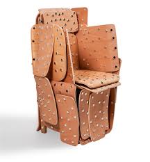
Crafterisation : Back to our core values
Back to local, the valuation of know-how, of craftmanship, of handmade and quality products… “Crafterisation” is a return to authentic materials and to the values of artisanship.
Caroline Notté advocates simplicity and authenticity. In her studio, built by Louis Herman de Koninck, she wishes to highlight a selection of artists yet again dedicate time to hand-made work (slow design). She brings forward the simplicity of forms and the beauty of materials shaped by the hand of the artist.
Towards more responsible design!
Xavier le Normand, French glass artist, transforms glass into masterpieces that lead you into a world of imagination and nature, inspired by his many travels. Constantly evolving in his techniques, he plays with the immediacy and movement ofincandescent glass, then revisits the whole surface of his sculptures – when cold – through engraving, cutting and textures.The translucency of the glass is often partially hidden from view, giving the material a deep opacity that invites the hand to touch.
COURTESY OF LKFF
Back to ROOTS!
Lucien Petit, works in another art of fire: ceramics. He creates his material according to his whims by mixing numerous different clays of local and foreign origins as well as additional minerals. He is interested in the binary oppositions between fullness and emptiness, of form and counter-form, of convex and concave, of mineral and organic…
COURTESY OF MODERN SHAPES
Krjst studio takes an intimate awareness of time both as the place of change and making dialogue between laborious work of weaving and the moment of the gesture. The binary relationship between the jacquard and the processor is already evocative in itself. such an oscillation between the past and the future between craftsmanship and technology, reflecting the importance of keeping our roots and yet living with the times.
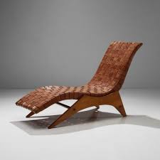
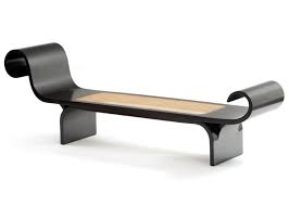
SELECTION OF FURNITURE


The 20th-century designer of Brazil created an opulent, tropical alternative to the cool linear stylings of Breuer, Eames, Jacobsen and Le Corbusier, featuring sensuous curves, richly coloured indigenous hardwoods and the luxurious leather and cane used in local craft. Works by Brazil’s midcentury greats, such as Oscar Niemeyer, Sergio Rodrigues, Joaquim Tenreiro and Lina Bo Bardi, have long been pursued by museum curators and specialist collectors.
The Brazilian design quest was for “authentic modernism,” combining lustrous indigenous materials and traditional local craftsmanship with European references and Bauhaus geometries to form an aesthetic all its own. The idea got a boost from two early visits by the Swiss-French midcentury modern architect Le Corbusier.
European immigrants adapted the aesthetic of the old world and used mellifluously named woods such as jacaranda, imbue, cabreuva and roxinho to construct distinct pieces that alluded to the rain forests, gauchos and fishermen of their new home.
Joaquim Tenreiro, a pioneer of furniture design in the mid 20th century, highlighted lightness as “a principal to which I felt modern Brazilian furniture should adhere … lightness which has nothing to do with weight per se, but with grace and functionality in space.” Sensuous curves, tropical woods, woven leathers and traditional techniques like caning and netting were all part of a style that developed in Brazil from the 1940s to the 1970s.
But because the pieces were not made in large numbers and were generally made to order for private homes, not corporate settings, they weren’t readily available or visible outside Brazil. Today, with authorised reissues of the most admired originals and the emergence of a new generation of artist-designers, they seem to have gained new relevance.
